Three contrast mistakes I keep seeing in shipped UI
Three contrast bugs show up in almost every shipped UI: ghostly placeholders, brand blue that misses AA by a hair, and a dark mode without an audit.
I do a lot of UI reviews and the same three contrast mistakes show up in almost every one. Faded gray placeholder text. Brand blue links on white that miss AA by a hair. And a dark mode that ships a toggle and calls it accessibility. None of these are exotic edge cases. They're the boring stuff. WebAIM's 2024 survey of a million home pages found low-contrast text on 79.1% of them, averaging 29.6 instances per page, and color contrast has been the most common accessibility failure on the web for years. So this isn't a niche complaint. It's the default state of the industry.
What annoys me is that each one takes about five minutes to fix if anyone bothers to measure. The fix is almost always a color two stops darker. Nobody runs the number, so nobody knows the number is bad.
Mistake one: placeholder gray that vanishes into the input
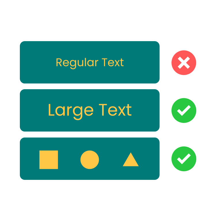
The version I see most often is a form field with placeholder text colored somewhere around #9CA3AF. Tailwind's gray-400. Looks tasteful in a Figma frame on a 6K monitor. On white, it measures 2.54:1, which fails AA normal text by a wide margin. WCAG's minimum for body text is 4.5:1, and these thresholds are not rounded. 4.499 fails. 2.54 is not even close.
The cheapest fix nobody bothers with is to bump the placeholder one stop darker, to gray-500 (#6B7280). On white that lands at 4.83:1, which clears AA normal by a slim margin. Done. The field still reads as muted, the cursor still pops, and the label-less form your designer fought for still works.
The deeper problem is that placeholders shouldn't be doing label duty in the first place. They disappear the moment the user types, they're inconsistently announced by screen readers, and they're often the only on-screen explanation of what the field wants. If you have a label above the input, the placeholder can stay subtle. If you don't, the placeholder is the label, and "subtle" is the wrong design choice. Pull a real <label> in, then make the placeholder darker so it's actually readable on the way to being typed over.
Mistake two: brand blue links on white that fail AA by 0.2
This one I run into weekly. A team picks Tailwind blue-500 (#3B82F6) as their link color because it looks like the internet. On white it measures 3.68:1. That's 0.82 short of AA normal. Not borderline. Failing.
The fix is two stops darker, to blue-700 (#1D4ED8), which lands at 6.70:1 on white. That's well into AA with healthy headroom (it doesn't quite clear AAA's 7:1 bar — close, but not over the line). The hue is close enough on a calibrated screen that your brand person will not even notice. If you're allergic to going that dark, blue-600 (#2563EB) gives you 5.17:1 and still passes AA normal. The hue shift between blue-500 and blue-600 is small enough that most users don't see it; the contrast shift is large enough that the lint check finally goes green.
I keep this contrast checker open in a tab specifically for this case. Drop both hex codes in, watch the number, drag the lightness slider on the text color until the AA badge flips. The whole exercise takes the time of one Slack notification.
颜色对比度检测
检测文本与背景色是否符合 WCAG 无障碍标准
The reason this mistake is so common is that designers eyeball the link color in isolation, on a 100% brightness laptop screen, against white. In that environment, blue-500 looks fine. On a dimmer monitor, in a sunlit room, on a phone with auto-brightness, it's a smudge. A measured ratio doesn't care about your viewing conditions; it's the floor under all of them. Verify before you ship.
Mistake three: a dark mode toggle without a dark mode audit
This is the one I find most lazy. Team adds a prefers-color-scheme toggle, swaps the background to #000000, leaves all the text colors on the existing palette, and ships. Now the same brand blue that already failed on white is also failing on dark navy. #2563EB on #0F172A measures 3.45:1. Below AA. The link is genuinely hard to read for anyone with even mild low-vision needs, and nobody on the team noticed because they all reviewed the page on a fresh OLED screen in a dim office.
The other half of this mistake is overcorrecting in the other direction. Pure white text (#FFFFFF) on pure black (#000000) measures 21:1, the maximum possible contrast ratio. Sounds great. In a dark room, it's also a small floodlight. Halation, ghosting, and eye strain start showing up after a few minutes of reading. The well-known compromise is a near-white on a near-black, something like #E2E8F0 on #121212, which still measures 15:1+ and clears AAA without burning a hole in anyone's retina. White text on #121212 measures 18.73:1, which is also fine ergonomically and easier to remember as a baseline.
The fix here is to do for dark mode what you should already be doing for light mode: walk every text and UI color pair and run the number. Most teams have a token system, so this is mechanical. Open the dark theme tokens, pair each foreground with each background it actually appears on, paste them into a checker, and read the badge. If a pair fails, nudge the foreground lightness up until it passes. The HSL slider in the tool is there exactly for this; you keep the hue, you move only the lightness, and a failing pair flips to passing in seconds without the brand person opening a ticket.
Yes, your designer was probably under deadline pressure when they made the dark theme. That's fine. The audit is what's missing, not the original work. A dark theme without a contrast pass is a half-shipped feature pretending to be a finished one.
What I'd do differently next sprint
I would set a single team rule: no color token lands in the design system without a measured contrast pair next to it in the doc. Foreground hex, background hex, ratio, AA pass or fail. One row per pair. If the foreground appears on three backgrounds, that's three rows. If the ratio fails, the token doesn't ship. This is a five-minute exercise per token and it catches all three of the mistakes above before anyone writes CSS.
The mechanical version of that rule is a CI check, but the cultural version is more useful: when a designer hands a Figma frame to engineering, the handoff includes the ratios. When the ratios are part of the artifact, they stop being something the front-end team has to argue for after the fact. The tool I keep coming back to for this is the same one I linked above; you can also nudge the lightness of either color directly in the slider until a failing pair passes, which is faster than walking back to the palette generator and picking a different swatch.
If you want a tighter palette workflow that produces accessible pairs from the start, this contrast checker pairs well with a Tailwind palette generator and a color wheel for picking the next hue over. Build the swatches, measure the pairs, ship the ones that pass. None of the three mistakes I've described would have shipped with that workflow, and none of them are interesting enough to deserve a third blog post in a year arguing about whether they matter. They don't. They just need fixing.

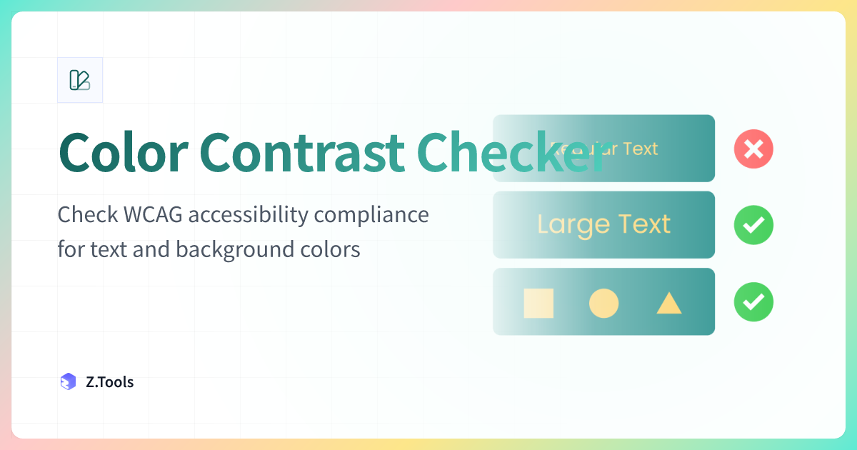
Color Contrast Checker · Z.Tools
Check WCAG accessibility compliance for text and background colors
- accessibility
- wcag
- design
- ui
继续阅读
TTS in an accessibility plan: where it helps, where it stops
Adding text-to-speech to a website or app looks like an accessibility win. Sometimes it is. Sometimes it is a checkbox that distracts from the real accessibility work. Here is the honest map of where TTS helps and where it does not.
Live captions are not the same as accessible captions
Auto-generated captions look like an accessibility solution and usually aren't. Here is the difference between live captions and accessible captions, why ADA and WCAG care, and what good practice looks like in 2026.
MiniMax HD vs Turbo vs Eleven Flash for finished work
MiniMax 2.8 HD, MiniMax 2.8 Turbo, and Eleven Flash v2.5 cluster at adjacent per-character prices but split sharply on use case: broadcast finals, fast Chinese agents, and 32-language streaming respectively. Here is which one to pick when.