Color contrast and color blindness aren't the same problem
A 4.5:1 contrast pass tells you nothing about whether a colorblind reader can use your UI. Two checks, two answers, and the verdicts often disagree.
A 4.5:1 contrast pass means your text has enough luminance difference from its background. It does not mean a reader with color vision deficiency can tell two of your hues apart. We built a vocabulary that confuses these two checks for one, and the audit screenshot you ship after the contrast pass is hiding the second question.
Roughly 1 in 12 men and 1 in 200 women have some form of CVD, and most of them have a red-green deficiency (deuteranomaly or protanomaly). For that audience, "passes WCAG AA" is a partial credit at best.
The math is hue-blind on purpose
WCAG 2's contrast formula takes two sRGB colors, gamma-corrects each channel, weights the channels with the standard luminosity coefficients, and divides. The output is a single luminance ratio. That number does not look at hue at all. It cannot, by construction. Pure red on pure black scores about 5.25:1, comfortably above AA-normal, because red has low luminance and black has near-zero luminance. The hue is doing none of the work in that calculation; the brightness gap is.
That same hue-blindness is what makes contrast a clean, automatable check. It's also what makes it an incomplete one. Color vision deficiency isn't a brightness problem. It's a problem of two hues collapsing into the same perceived color. WCAG 2 wasn't designed to catch that, so it doesn't.
Pairs that pass contrast but fail CVD
Five rows. Real values. Each pair has a WCAG verdict and a CVD verdict, and the two verdicts don't track.
| Pair | WCAG 2 ratio | AA verdict | CVD verdict |
|---|---|---|---|
#FF0000 red on #000000 black | 5.25:1 | passes AA-normal | degraded for protanopia and deuteranopia (red reads as dark brown) |
#FF0000 red on #00FF00 green | 2.91:1 | fails AA-normal | collapses under red-green CVD |
#0072B2 Wong blue on #FFFFFF white | 5.19:1 | passes AA-normal | clean across all three CVD types |
#2CA02C matplotlib green on #FFFFFF white | 3.40:1 | fails AA-normal | clean (the contrast is the problem, not the hue) |
#E69F00 Wong orange on #FFFFFF white | 2.25:1 | fails AA-normal | clean (CVD-friendly hue, contrast still too low) |
The first row is the article's whole thesis in one line. Pure red on black is the textbook case where contrast and CVD give opposite verdicts. The Wong palette rows show the inverse: a hue can be CVD-clean and still flunk WCAG if its luminance against the background is too close. They are independent checks. Treating one as a stand-in for the other is how accessible-on-paper UIs end up confusing real users.
A 90-second second check
Once you've cleared 4.5:1 (or 3:1 for large text), open a CVD simulator and paste in the same screen. David Nichols' simulator at davidmathlogic.com/colorblind covers deuteranopia, protanopia, and tritanopia in one view, side by side with the original. If two elements that need to be distinguishable (a "destructive action" button next to a "primary action" button, two lines on a chart, a status pill in a table row) merge in the deuteranopia view, you have a CVD problem regardless of the contrast number.
Coloring for colorblindness, by David Nichols
For data viz specifically, Bertrand Wong's 8-color palette (Nature Methods, 2011) is the closest thing the field has to a default safe choice. The dark blue, orange, sky blue, green, yellow, vermillion, reddish purple, and black in that palette are designed to be distinguishable across the three common CVD types. They aren't all WCAG-compliant against every background (the orange in the table above is a good reminder), but they give you a head start on the hue side of the problem so you can spend your effort on contrast.
颜色对比度检测
检测文本与背景色是否符合 WCAG 无障碍标准
Treat WCAG contrast as the floor, not the ceiling. It's the regulator-facing number, it has to pass, and if you can't clear 4.5:1 you don't have an accessibility story at all. But a pass on contrast is not the end of the conversation; it's the start of one.

The specific recommendation: every time a contrast check goes green, run the same screen through a CVD simulator before you close the ticket. Sixty seconds, three views, one extra screenshot in the audit folder. The reds that read as brown, the green-on-orange status pills, the red-vs-green chart lines all surface in that pass and nowhere else.
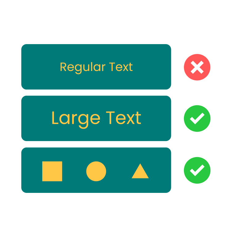
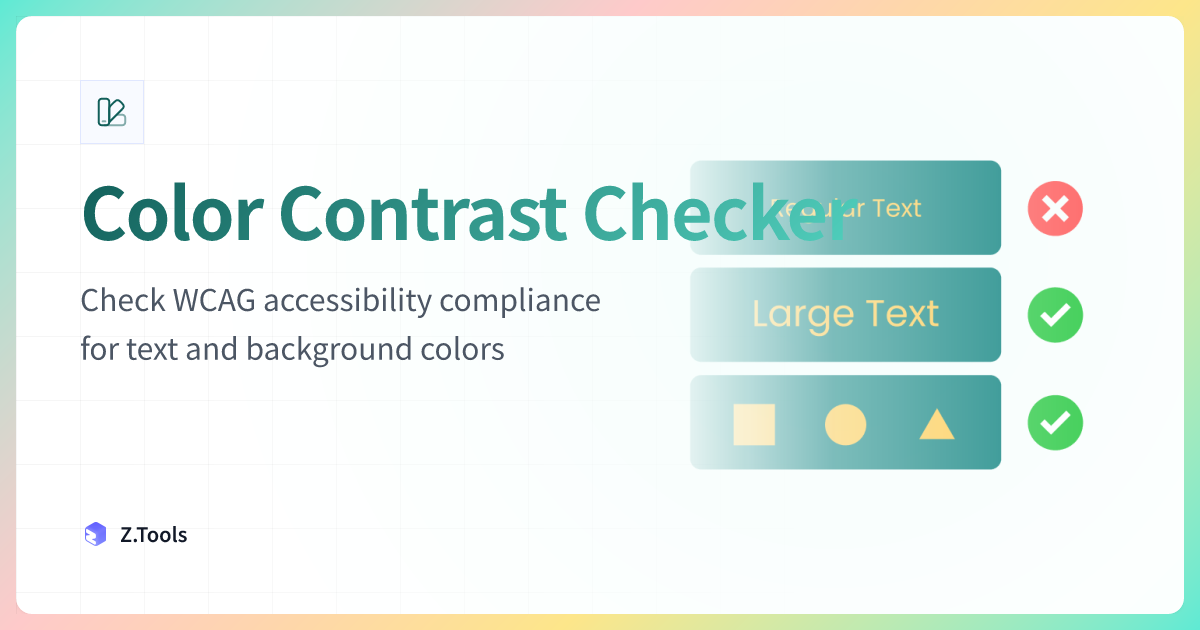
Color Contrast Checker · Z.Tools
Check WCAG accessibility compliance for text and background colors
- accessibility
- color-blindness
- wcag
- design
继续阅读
TTS in an accessibility plan: where it helps, where it stops
Adding text-to-speech to a website or app looks like an accessibility win. Sometimes it is. Sometimes it is a checkbox that distracts from the real accessibility work. Here is the honest map of where TTS helps and where it does not.
Live captions are not the same as accessible captions
Auto-generated captions look like an accessibility solution and usually aren't. Here is the difference between live captions and accessible captions, why ADA and WCAG care, and what good practice looks like in 2026.
MiniMax HD vs Turbo vs Eleven Flash for finished work
MiniMax 2.8 HD, MiniMax 2.8 Turbo, and Eleven Flash v2.5 cluster at adjacent per-character prices but split sharply on use case: broadcast finals, fast Chinese agents, and 32-language streaming respectively. Here is which one to pick when.