Dark mode contrast: why your pretty navy palette fails AA
A dark-mode toggle does not fix accessibility. Re-test every token pair, fix the bright-link-on-navy trap, and keep focus rings visible. Here's the workflow.
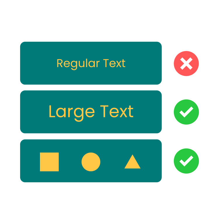
A dark-mode toggle does not fix contrast. Most teams ship one anyway and assume the higher overall luminance gap will cover them. It won't. The same brand link that clears AAA on white drops to 2:1 on navy. The same dim placeholder that passes on the light theme fails when you flip the surface. WCAG still demands 4.5:1 for normal body text and 3:1 for large text and UI components, and the thresholds are not rounded. As Boia's accessibility team puts it: offering a dark mode does not satisfy the WCAG color contrast requirements. You have to retest every pair.
This is for designers and front-end devs shipping a dark-mode toggle, especially if your dark surface is a navy like #0F172A rather than pure black. I had to learn this twice. The first time, I copy-pasted the light tokens, swapped the background, and called it accessibility. Two months later a low-vision user politely told me the link color was invisible.
The assumption that breaks: dark equals high contrast everywhere
The intuition every designer carries into dark mode is that a dark surface gives you more headroom. Bright text on dark is the marketing pitch for OLED. The math agrees in the extreme case: white on pure black is 21:1. From there, the assumption goes, anything readable will pass.
What actually happens is more boring. The body-to-background gap does usually go up. Everything else gets worse. Saturated brand blues lose contrast against a navy surface because their luminance is already low. Subtle gray placeholders that worked at 5:1 against white land near 4:1 against navy and fail AA-normal. Borders disappear because both the divider and the background are dark. Focus rings made of a 2px brand-color outline turn invisible: they were tuned for a white page.
WebAIM's 2024 Million audit found low-contrast text on 79.1% of homepage front pages. The dark-mode subset is, from auditing component libraries, worse, not better, because the testing burden doubles and most teams only test once.
Where the same palette breaks when flipped
Take a sober slate-and-blue palette, the kind every Tailwind project ships. Body in #0F172A. Dimmed body in #475569. Primary link in #2563EB (Tailwind's blue-600). Hover in #1D4ED8. Subtle/placeholder in #64748B. Decorative border in #E2E8F0. White surface.
In light mode it almost all passes. Body on white is 17.85:1. Dimmed body is 7.58:1, AAA. Link in blue-600 on white is 5.17:1, AA-normal. Hover in blue-700 is 6.70:1, AA with a little headroom (it doesn't quite clear AAA's 7:1, which is worth knowing). Subtle text is 4.76:1, AA. Five out of six clear AA. Only the divider at 1.20:1 fails the 3:1 non-text bar, and that's fine if the divider is purely decorative.
Now flip the surface. Background is #0F172A. Body in #F8FAFC is 17.06:1, still AAA. Dimmed body in #94A3B8 is 6.96:1, comfortably AA on normal text. So far so good. Then the rest of the palette walks off the cliff.
The link, the same #2563EB you used on white, is 3.45:1 on navy. That fails AA-normal and barely clears AA-large. The hover state in #1D4ED8 falls to 2.66:1, which fails even the AA-large bar. Subtle text in #64748B measures 3.75:1, AA-large but failing AA-normal. The divider in #334155 (the dark-mode equivalent) lands at 1.81:1, which fails the 3:1 functional-UI threshold.
That's three failures and one downgrade from a palette that looked fine in light mode. The fix is to lift the saturated blues toward higher lightness in the dark theme. #60A5FA (blue-400) on #0F172A is 7.02:1, AA-normal with comfortable headroom. Hover goes one step lighter still, like #93C5FD, so it stays visibly distinct. Subtle text moves up the slate ladder until it clears 4.5:1.
The takeaway from the side-by-side: the contrast logic for dark mode is mostly a different palette from the light one. They're not symmetric. Dark mode wants lighter, less saturated foregrounds for everything that isn't body text. If your design tokens hardcode a single brand shade for both themes, half of your themed components are sitting in fail states.
Pure white on pure black is technically perfect and ergonomically wrong
There's a temptation, once you've been burned by navy, to go the other way: pure black background, pure white text, 21:1, done. WCAG passes. Your eyes do not.
Pure white on pure black causes halation, especially at small sizes on OLED panels in low light. Letters bloom and smear. Long-form reading gets uncomfortable in about ten minutes. The accessibility community generally recommends against it for body text, even though the ratio is the highest you can hit.
The pattern that works in practice is off-white text on a near-black surface. Material's recommended dark surface is #121212. Pair it with #E2E8F0 and you get 15.20:1, comfortably AAA but visually softer. The dark navy #0F172A works too, with #F8FAFC body at 17.06:1. Both leave plenty of room for primary text and don't shred your retinas after sundown.
Contrast is a floor, not a target. Hitting 4.5:1 means you're allowed to ship; it doesn't mean the design is comfortable. Once you're past the floor, the right move is usually to pull back on raw luminance and trade some headroom for ergonomic ease.
A four-pass workflow for verifying a dark theme
Here's how I work through a dark theme now, after eating the link-on-navy mistake more than once. It's four passes, each takes maybe fifteen minutes for a small palette, and you don't redo the whole color system.
The first pass is body text. Pick the dark surface (your background and your card surface, if they differ) and the foreground for primary body text. Measure the pair. You want something north of 12:1 here, not because WCAG demands it but because anything closer feels muddy in real reading. Off-white in the #E2E8F0 to #F8FAFC range against a near-black or navy surface in the #0F172A to #121212 range will land you in that zone.
The second pass is the secondary text family: dimmed body, captions, helper text, placeholder copy. Each pair gets measured. The trap is the placeholder, the dimmest token in your palette and the one most likely to fall under 4.5:1. WCAG doesn't formally exempt placeholder text from contrast minimums, so treat it as body. If you can't hit 4.5:1 without making it visually shout, the design is asking for too dim a token, so step it up to a higher slate value.
The third pass is the saturated brand colors: links, buttons, badges, focus rings. This is where most dark themes fall apart. Take your light-mode link color, paste it into the contrast checker here against your dark background, and watch what happens. If you get below 4.5:1, lift the hue toward higher lightness. I'd lift the link three shades, not one, because the hover state needs to climb above the resting state and you'll run out of room if you only move once. Use the brightness slider to nudge a near-miss without abandoning the hue. For Tailwind palettes the rough rule is: a blue-600 link in light mode wants to become blue-400 in dark, not stay at blue-600.
The fourth pass is the structural UI: borders, dividers, focus outlines, disabled states, anything that has to clear the 3:1 non-text threshold. Decorative dividers don't need to clear it. Functional ones (a divider between interactive table rows, a border that signals input state) do. Focus rings always do. If a focus ring fails 3:1 against the dark surface, lighten the ring or add a 1px dark inset so the contrast is measured against the inset, not the background.
颜色对比度检测
检测文本与背景色是否符合 WCAG 无障碍标准
The WCAG numbers are merciless about pairs. Saying "we use blue-600 for links" tells me nothing until you tell me what surface it sits on. Same shade, different surface, different verdict. Run every pair, and re-run when you flip the theme; the brightness slider is faster than re-pasting hex codes when you're hunting for a passing version of the brand hue.

The single highest-impact change for a dark theme today: open every link, focus ring, placeholder, and functional border, paste the foreground/background pair into a checker, and write the ratio next to the token. Anything under 4.5:1 for text or 3:1 for UI gets fixed before the next deploy. The rest of the palette is allowed to keep its mood. The brand still works. The link, finally, is readable.
Color Contrast Checker · Z.Tools
Check WCAG accessibility compliance for text and background colors
- accessibility
- dark-mode
- wcag
- design
继续阅读
TTS in an accessibility plan: where it helps, where it stops
Adding text-to-speech to a website or app looks like an accessibility win. Sometimes it is. Sometimes it is a checkbox that distracts from the real accessibility work. Here is the honest map of where TTS helps and where it does not.
Live captions are not the same as accessible captions
Auto-generated captions look like an accessibility solution and usually aren't. Here is the difference between live captions and accessible captions, why ADA and WCAG care, and what good practice looks like in 2026.
MiniMax HD vs Turbo vs Eleven Flash for finished work
MiniMax 2.8 HD, MiniMax 2.8 Turbo, and Eleven Flash v2.5 cluster at adjacent per-character prices but split sharply on use case: broadcast finals, fast Chinese agents, and 32-language streaming respectively. Here is which one to pick when.