WCAG 2 vs APCA: what changes when WCAG 3 lands
WCAG 2's 4.5:1 ratio and APCA's Lc score don't always agree. Here's where they diverge and how to ship UI that survives the WCAG 3 transition.
WCAG 2's 4.5:1 ratio comes from a luminance formula whose roots go back to CRT-era display research, and it's still the rule regulators audit against in 2025. APCA, the perceptual algorithm proposed for WCAG 3, scores readability differently, and on a surprising number of common color pairs the two algorithms hand back opposite verdicts. If you understand where they disagree, you can ship UI today that passes WCAG 2 and won't have to be rebuilt the morning WCAG 3 lands.
This is for a11y specialists, senior designers, and design-system maintainers who already know what 4.5:1 means and want to know what to do about Lc 60. I'll keep the math honest, mark the approximations as approximations, and skip the religious war.
Where 4.5:1 actually came from
WCAG 2.0 dropped in 2008, and the contrast ratio formula it uses was new to web specs at the time but old as a measurement: take two sRGB colors, gamma-correct each channel, weight the channels with the standard luminosity coefficients (0.2126 R, 0.7152 G, 0.0722 B), get a relative luminance for each color, then divide. Add 0.05 to both terms first to keep the math stable near black. The result is a number between 1:1 and 21:1.
The thresholds (4.5:1 for normal text AA, 3:1 for large or non-text, 7:1 for AAA) are set against this scale. They aren't rounded. A pair that measures 4.499:1 fails the 4.5:1 bar even though every checker UI shows it as 4.5. The numbers you see in tooling are display rounding, not the rule.
The model is straightforward and that's part of its charm. It's also part of the problem. The luminosity coefficients model how a standard observer perceives a flat patch of light on a calibrated CRT or LCD at a comfortable viewing distance. They are hue-blind in the sense that they collapse the full perceptual story (chroma, surround, font weight, size, polarity) down to one luminance number per color. On a phone OLED in 2025, with sub-pixel rendering and sub-pixel-level antialiasing, that's a useful approximation, not a measurement of what your retina actually does. The math isn't wrong, exactly. It just answers an older question.
You can still feel the gap when you stare at pure red text on black. WCAG 2 says 5.25:1, comfortably AA. Your eyes report something closer to "this is hard to read at body size." APCA's whole pitch is that the second reading is the one that matters.
What APCA does differently
APCA stands for the Advanced Perceptual Contrast Algorithm. The author is Andrew Somers, the working draft of WCAG 3 (still in W3C Working Draft as of 2025) names APCA as the proposed contrast method, and the GitHub repo at github.com/Myndex/apca-w3 is where the reference implementation lives.
Three things make APCA different from a 4.5:1 ratio in practice.
It models perception, not just luminance. The algorithm estimates a perceived contrast and reports a number called Lc, in a 0 to about 108 range. Lc 60 is the body-text minimum, Lc 75 the body-text preferred, Lc 90 the fluent best practice, Lc 45 for large text, Lc 30 the absolute floor for any text, and Lc 15 for non-text controls. The scale is non-linear and intentionally not interchangeable with WCAG 2 ratios.
It cares about polarity. Light text on a dark background and dark text on a light background are not the same problem. APCA scores them with opposite signs (negative for dark-on-light, positive for light-on-dark by convention; tools usually display the magnitude). The rest of this article uses Lc as a magnitude for clarity, but the polarity convention is real and worth knowing about, especially when you're reading raw API output.
It accounts for text size and weight. The same color pair might clear the body-text bar at 16px regular and fail it at 14px regular, or pass at 18px medium and fail at 16px regular. WCAG 2 has a single jump from "normal" to "large" with the 4.5 vs 3 thresholds; APCA has a continuous matrix of size-and-weight against Lc.
The practical consequence: APCA doesn't tell you "AA pass." It tells you something closer to "this color pair is suitable for 16px regular body text" or "this color pair is fine for a 24px headline but would be marginal at body size." That's a richer answer. It's also a harder one to embed in a one-line CI assertion.
The table where the algorithms disagree
Here's the part that I think actually changes how you design. Take six color pairs, score them under both algorithms, and watch the verdicts diverge.
Numbers below: WCAG 2 ratios are exact, computed from the spec. APCA Lc bands are approximate; for the actual decision, run the pair through a public APCA calculator (apcacontrast.com is the canonical one). The point isn't the precise Lc; it's the direction of disagreement.
- Pure red
#FF0000on black#000000. WCAG 2 ratio about 5.25:1. AA-normal pass. APCA lands somewhere around Lc 50 to 55, which is below the Lc 60 body-text minimum. WCAG 2 says ship it; APCA says it's hard to read at body size. Anyone who has ever set 14px red on a black product card already knows APCA is closer to right here. - White
#FFFFFFon Tailwind blue-500#3B82F6. WCAG 2 ratio about 3.68:1. AA-normal fail. APCA lands roughly at Lc 65 magnitude, which is above the body minimum. Two algorithms, opposite verdicts. WCAG 2 will block the button; APCA will let it through (especially at button-label weight). - Bright yellow
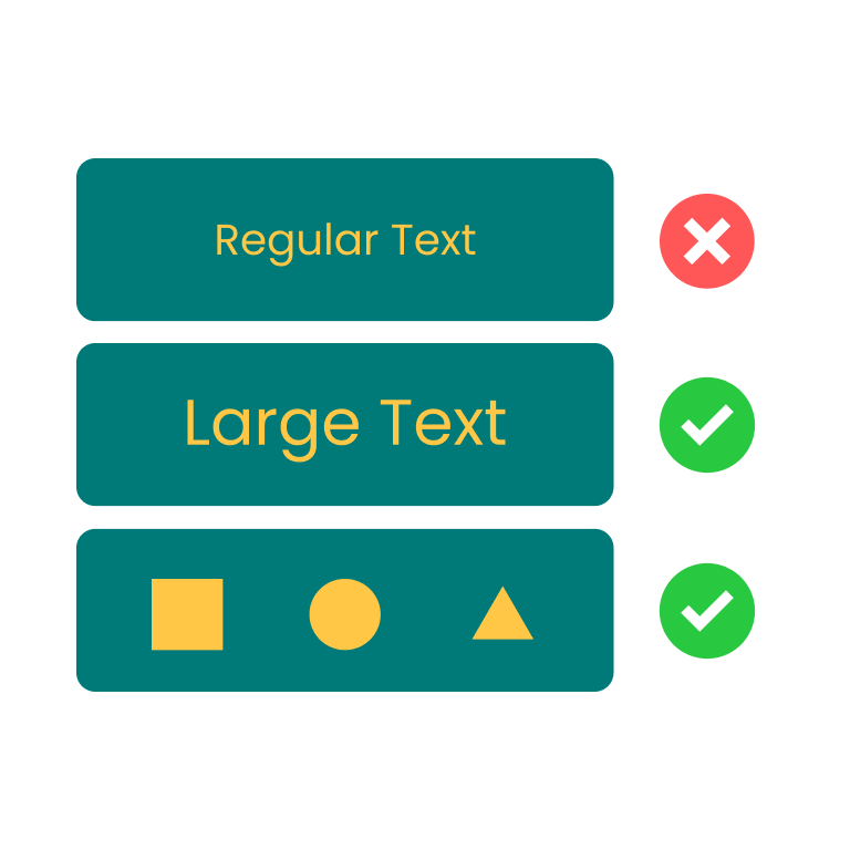
#FFC745on dark teal#007A78. WCAG 2 ratio about 3.33:1, which is the contrast checker's default sample pair. AA-normal fail by a wide margin, AA-large fail. APCA scores this pair below the Lc 60 body minimum too. Both algorithms agree the pair is weak; APCA is the harsher one because the yellow's hue is doing more work for human readability than the luminance gap suggests. - Gray
#888888on white#FFFFFF. WCAG 2 ratio about 3.54:1. Fails AA-normal. APCA also rates this well below Lc 60. Agreement, both saying no. - Black
#000000on bright yellow#FFFF00. WCAG 2 ratio about 19.56:1. AAA pass at any size. APCA lands above Lc 100 magnitude. Agreement, both saying ship it. - Tailwind blue-600
#2563EBon slate-900#0F172A. WCAG 2 ratio about 3.46:1. Fails AA-normal. APCA scores this in the "marginal at body size" band. Half-disagreement: WCAG 2 is a hard fail, APCA is a "depends on size and weight."
Five of those six pairs have at least one algorithm making a verdict the other algorithm wouldn't make alone. The pure-red-on-black row is the canonical APCA-vs-WCAG-2 case study; the white-on-blue-500 row is where the day-to-day Tailwind designer keeps getting bitten. If you've ever shipped a button that "felt fine but failed the audit" or "passed the audit but felt off," you've already had this argument with yourself.
Should you switch today
The honest answer is no, and yes, and not exactly.
No, because the legal and procurement floor is still WCAG 2. If your product has a VPAT, an accessibility statement, a government customer, or a class-action risk surface, the audit is going to run against 4.5:1 and 3:1, and the Lc number won't help you in the conformance column. Shipping a UI that fails WCAG 2 and passes APCA is not a defensible posture in 2025.
Yes, in the sense that APCA is an excellent second opinion when WCAG 2 gives you a verdict that doesn't match how the pair reads. The pure-red-on-black case is the obvious one: the ratio says it's fine and your eyes say it isn't. Run the pair through an APCA calculator and you get a number that explains the disagreement. If you're a designer pushing back on a brand color, "it passes WCAG 2 but APCA puts it below body-text minimum" is a useful sentence in the room.
Not exactly, in the sense that the smart move is to design to the stricter of the two, not to pick one. If a pair passes WCAG 2 but fails APCA, treat it as risky and either shrink its surface (make it a heading, not body text) or pick a different pair. If a pair fails WCAG 2 but passes APCA, you still have to fix it for compliance reasons, but the fix is probably gentler (you might only need to nudge one channel) than if both algorithms agreed it was unreadable.
I'd start using APCA as a co-pilot now. The cost is low. The upside is that when WCAG 3 lands and the conversation shifts, you've already retrained your intuition about which pairs hold up perceptually.
What the rest of the industry is doing
Adobe Spectrum publishes its color tokens with explicit "approved against this surface at this ratio" annotations, and recent Spectrum work has experimented with APCA-style perceptual checks alongside the existing ratio checks. The pattern Spectrum locks down (each shade has a known role on each surface) is the right one regardless of which algorithm you're auditing under.
Stark, the Figma plugin, has shipped APCA scoring alongside WCAG 2 ratios for a couple of release cycles. It treats them as parallel views, not as one replacing the other, which matches the "second opinion" posture above.
Chromium's DevTools experimentally surfaced APCA as a contrast option behind a flag a few releases ago. Last I checked, the WCAG 2 ratio is still the default and APCA is opt-in. Firefox's Accessibility Inspector remains WCAG-2-only at the time of writing.
The Tailwind community itself is split. Some design systems (Catalyst, the Tailwind UI premium components) ship pairs that comfortably clear AA. Others (one-off marketing themes generated by less careful palette tools) still happily produce blue-500 on white as a default link color, which is the canonical "passes nothing perceptually but ships everywhere anyway" pair.
The deepest signal is what happens at large product orgs that maintain their own design languages. They stop trusting any single algorithm and start storing measured ratios next to token values. A token that says link-on-light: #1D4ED8 / 8.59:1 / Lc 92 carries more information than either number alone, and the engineer who reaches for it five months later doesn't have to re-derive the decision.
颜色对比度检测
检测文本与背景色是否符合 WCAG 无障碍标准
For day-to-day work, Z.Tools' contrast tool reports the WCAG 2 ratio against AA, AA-large, AAA, AAA-large, and non-text thresholds, which is exactly the floor you need to ship against today. When a pair feels off but passes the ratio (or vice versa), cross-check it against an APCA calculator before locking the token. That two-step is worth maybe ninety seconds and catches the disagreements above before they become design-system commitments.
APCA Contrast Calculator (Myndex)

If I had to write the design-system rule on one line, it'd be this: ratio ≥ 4.5:1 for normal text gets you compliant, Lc ≥ 60 for body text gets you readable, and the pair you ship should clear both. When the two algorithms disagree, the pair is a tell. Either the WCAG 2 ratio is rewarding a luminance trick the eye doesn't actually believe (pure red on black), or the math is being unforgiving about something the eye accepts (white on a saturated mid-blue). Both cases deserve a second look. Build the second look into your token review and the WCAG 3 transition becomes a relabeling exercise, not a redesign.
Color Contrast Checker · Z.Tools
Check WCAG accessibility compliance for text and background colors
- accessibility
- wcag
- apca
- color
继续阅读
TTS in an accessibility plan: where it helps, where it stops
Adding text-to-speech to a website or app looks like an accessibility win. Sometimes it is. Sometimes it is a checkbox that distracts from the real accessibility work. Here is the honest map of where TTS helps and where it does not.
Live captions are not the same as accessible captions
Auto-generated captions look like an accessibility solution and usually aren't. Here is the difference between live captions and accessible captions, why ADA and WCAG care, and what good practice looks like in 2026.
MiniMax HD vs Turbo vs Eleven Flash for finished work
MiniMax 2.8 HD, MiniMax 2.8 Turbo, and Eleven Flash v2.5 cluster at adjacent per-character prices but split sharply on use case: broadcast finals, fast Chinese agents, and 32-language streaming respectively. Here is which one to pick when.