Building an accessible Tailwind palette without losing your brand
Yes, you can keep your brand color and still pass WCAG AA. The trick is knowing which Tailwind shades clear which thresholds, and refusing to use blue-500 for everything.
Yes, you can keep your brand color and still pass WCAG AA across body, headings, links, buttons, and form states. The trick is to stop treating the Tailwind shade ladder as eleven flavors of decoration and start treating it as a contrast control. Once you know that blue-500 against white sits at 3.68:1, that blue-700 clears AA with comfortable headroom on the same background (and that you have to step up to blue-800 to get AAA), and that the same blue-500 actually passes AA on a dark slate page, the question of "what shade do I use for this link" becomes a lookup, not a debate.
This is for front-end developers and design-engineers shipping with Tailwind v3 or v4 in production. The example brand is Tailwind's default blue. The same logic transfers to any custom brand palette generated through a tool like a TailwindCSS palette generator, as long as you measure each step against the surfaces it'll sit on.
The 50-950 ladder is a contrast tool, not just a shade tool
Tailwind v4 ships an 11-step ladder for every color: 50, 100, 200, 300, 400, 500, 600, 700, 800, 900, 950. Most teams treat the steps as a vibe gradient and reach for the middle ones because they "look like the brand." That's how you end up with text-blue-500 on white headings and a Lighthouse score that won't move.
The ladder is more useful read as a contrast curve. Against a white background, the top steps (50, 100, 200) are background-only territory; you can't put text on them at all. The middle (400, 500, 600) is the muddy zone where AA decisions happen. The bottom (700, 800, 900, 950) is where text actually lives. Against a dark background, the curve flips, and the same shade that was unusable on white becomes readable on slate.
WCAG 2.1 SC 1.4.3 sets the AA bar at 4.5:1 for normal text and 3:1 for large text. SC 1.4.6 raises that to AAA at 7:1 normal and 4.5:1 large. SC 1.4.11 covers non-text and UI components, also at 3:1. Large text means 18pt and up, or 14pt and up if bold. The thresholds are not rounded; 4.499:1 fails. The WebAIM Million 2024 audit found that 79.1% of home pages still ship low-contrast text, so this isn't a niche fight.
The reason the ladder works as a contrast tool is that Tailwind's steps are designed to step roughly one perceptual unit at a time. Each jump up the ladder corresponds to a meaningful change in measured ratio against a fixed background, not just a small vibe shift. That's why the gap between 500 and 700 in the blue family covers about three points of ratio (3.68:1 to 6.70:1) on white, and the next two steps push you to 8.72:1 (blue-800) and 10.36:1 (blue-900); you're walking through three different WCAG buckets in four steps. Once you internalize that, the question of "which shade" becomes "which ratio do I need," and the ladder hands you the answer.
Which shade goes where: the body, heading, link, button, border map
Here's the rule I keep on a sticky note. On a white surface:
- Body text wants
slate-900(#0F172A) at 17.85:1, orgray-700(#374151) at 10.31:1 if you prefer softer paragraphs. Both clear AAA. - Headings sit in the same range. I usually push to
slate-900so heading weight stays visually distinct from body weight, not from a contrast bump. - Links default to
blue-700(#1D4ED8) at 6.70:1. AA-normal with healthy headroom (just shy of AAA's 7:1 line; bump toblue-800if you want the AAA badge). This is the link color I reach for first. - Primary button backgrounds use
blue-600(#2563EB) orblue-700. White text onblue-600measures 5.17:1, which clears AA-normal. White onblue-700measures 6.70:1, comfortably AA. If the button label needs AAA on the fill, push toblue-800(8.72:1). - Borders and dividers belong in
gray-200orblue-200. Borders fall under SC 1.4.11 only when they communicate state (focus rings, error outlines). Decorative dividers don't need to clear 3:1. - Placeholder text is the trap.
gray-400(#9CA3AF) on white measures 2.54:1, which fails AA-normal. Usegray-500(#6B7280) at 4.83:1 minimum. WCAG doesn't formally exempt placeholder text from contrast requirements; treat it as body text. - Focus rings work as a
blue-600outline with a 2px white offset, orblue-700directly. The ring needs 3:1 against the adjacent surface, not against the focused element.
The shape of this map is the actual takeaway. There's a usable range for each role, and the range almost never overlaps with the middle of the ladder. If you find yourself reaching for 500 for text or icons on a white surface, you're probably about to fail an audit.
The brand-500 trap and how to fix it
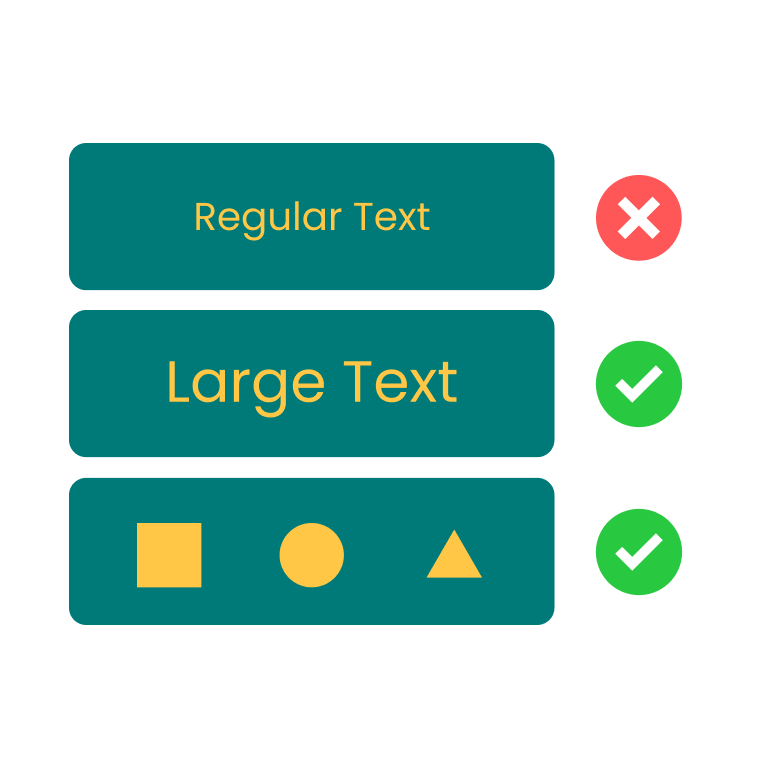
Designers love the 500 step because it's the saturated, recognizable face of the brand. On marketing sites, that face shows up as text-blue-500 for links, bg-blue-500 for primary CTAs with white text, and border-blue-500 on focused inputs. Three plausible patterns. All three fail AA on white.
#3B82F6 (Tailwind's blue-500) on #FFFFFF measures 3.68:1. That fails AA-normal (4.5:1) and fails AA-large (3:1, but only by a hair, and 3.68 reads as "passes" in some online checkers because of rounding bugs). White text on #3B82F6 is the same ratio in reverse: 3.68:1. So a bg-blue-500 button with white label text is also failing AA. Most teams ship this anyway, and it's most teams' single biggest accessibility regression.
The fix is one step down the ladder for buttons (blue-600 at 5.17:1 white-on-fill, AA-normal pass), and two steps for body text and links (blue-700 at 6.70:1, comfortable AA pass; blue-800 at 8.72:1 if you want the AAA stamp). You don't lose the brand. blue-700 reads as "the same blue, more confident." On a fast comparison test I do when convincing a designer, I'll mock up the same hero with the link in 500, 600, and 700, run all three through the WCAG checker on Z.Tools, and let the contrast number win the argument. It almost always does.
Dark mode flips the ladder
If you only ever ship light mode, you can stop reading. Dark mode is where the contrast intuition most teams build up gets inverted, and where you'll see the blue-700 link that was solid AA on white become unreadable on slate.
Here's the same Tailwind blue family, this time measured against #0F172A (slate-900), the de facto dark-mode background for Tailwind apps:
blue-50(#EFF6FF) at 16.40:1. Far too bright for body text, fine as a heading accent.blue-100at 14.63:1,blue-200at 12.56:1,blue-300at 9.90:1.blue-400(#60A5FA) at 7.02:1. Just clears AAA-normal, comfortably AA. My default link color in dark mode.blue-500(#3B82F6) at 4.85:1. AA-normal pass. The same shade that fails on white.blue-600(#2563EB) at 3.45:1. Fails AA-normal, passes AA-large. This is the pitfall. A team copies itstext-blue-600link from light mode into the dark theme and unknowingly drops below the body-text bar.blue-700and below sit at 2.66:1 and worse. Unusable on a dark page.
The light-mode ladder is "darker is better." The dark-mode ladder is the opposite: lighter steps win. If your design tokens hardcode a single brand shade for both themes, half of your themed components are sitting in fail states. The honest answer is to define --color-link as blue-700 in light mode and blue-400 in dark mode, and stop pretending one number can do both jobs.
There's a second trap on dark surfaces that's worth flagging. AAA-normal on dark backgrounds requires 7:1, which blue-400 clears at 7.02:1 only by a hair. If you're targeting AAA across the product with comfortable headroom, you'll need to climb to blue-300 (9.90:1) for body text on slate-900, and that lighter shade can start to feel washed-out in long paragraphs. Most product teams I've worked with settle for AA on dark mode and AAA where they can get it cheaply, which the spec explicitly allows; AA is the legal minimum, AAA is the aspiration.
颜色对比度检测
检测文本与背景色是否符合 WCAG 无障碍标准
I run every paired token through the WCAG checker on Z.Tools before promoting it to the design system. The HSL lightness slider on the tool is the part I use most, because it lets me nudge a brand hue up or down a few degrees without abandoning the hue and falling back to "well, just darken it 10%." If a designer hands me a brand red that fails on both themes, I can drag the slider until it passes and then ask whether the new lightness is still on-brand, instead of arguing in the abstract.
A workflow that scales: lock pairs in tokens, not in components
The reason most palettes drift out of compliance over a year of feature work isn't that the contrast logic is hard. It's that the logic gets re-derived every time someone builds a new component. A new banner ships with text-blue-500 on a gray-50 background because the engineer who built it wasn't thinking about pairs.
Tokens fix this if you define them as pairs, not as values. Don't ship --color-brand: #3B82F6. Ship --color-link-on-light: #1D4ED8 and --color-link-on-dark: #60A5FA. The token name encodes the surface assumption, so the next person who reaches for the wrong one feels the friction. Carbon Design System does this aggressively; Adobe Spectrum's docs use the convention that the 700 shade of any color is the one approved against white at 3:1, and 900 is the one approved at 4.5:1. Both systems push the contrast decision out of components and into the token layer where it can be audited once.
The workflow I land on, after watching enough teams ship and re-fix this:
- Pick your brand hue. Generate the full 50-950 ladder, either with Tailwind defaults or with a palette generator.
- For light mode, measure each step from 400 to 950 against
#FFFFFFand against your common card background (#F8FAFC,#F1F5F9). Mark the AA-normal, AA-large, and AAA-normal pass thresholds on each step. - For dark mode, measure 50 to 600 against
#0F172Aand against your dark card surface. Mark the same thresholds. - Define one token per UI role per theme: link, body, heading, button-bg-on-light, button-bg-on-dark, focus-ring, placeholder. Each token resolves to a Tailwind shade that has a verified contrast ratio for the surface it'll sit on.
- Document the contrast ratio next to the token value in the design system docs. Future engineers should see
blue-700 / 6.70:1 on whitenot justblue-700. - When a designer wants to use a non-token shade, run it through the WCAG checker first and add it as a new token if it passes. No raw shade references in components.
The 30-minute version of this is: take 30 minutes, audit your current text- and bg- Tailwind classes with rg, drop them into a contrast checker in batches of five, and replace any failing pair with the next ladder step in the failing direction. You will rewrite about a fifth of your component classes and clear most of your existing AA debt in an afternoon.
颜色对比度检测
检测文本与背景色是否符合 WCAG 无障碍标准

TailwindCSS 调色板生成
输入任意颜色,自动生成完整的 TailwindCSS 色阶配置
色环配色
基于色彩理论生成和谐配色方案

图片配色提取器
智能提取主色调并生成含 PANTONE 色号的调色板
The brand argument is real. A blue-700 link does feel a notch more serious than a blue-500 link, and there is a stretch of conversation with design where you'll have to defend the change. The defense is that you're still using the brand color; you're just using the version of it that people with low-contrast vision can read. The 500 step is still in the system, used wherever it's measured to pass: dark-mode body text, oversized hero numerals, inverted button states. Stop reaching for blue-500 on white by default. Pick the shade that clears the threshold for the surface, and let the token system remember the rule for you.
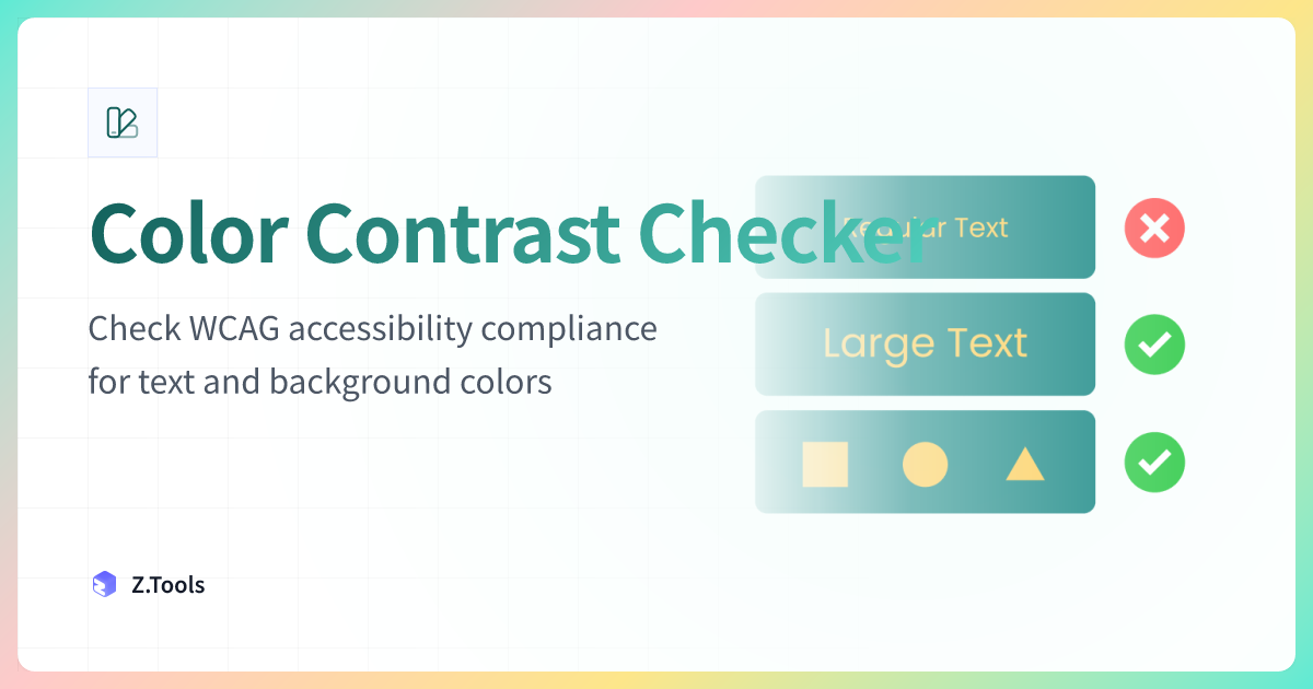
Color Contrast Checker · Z.Tools
Check WCAG accessibility compliance for text and background colors
- accessibility
- tailwind
- wcag
- design-system
继续阅读
TTS in an accessibility plan: where it helps, where it stops
Adding text-to-speech to a website or app looks like an accessibility win. Sometimes it is. Sometimes it is a checkbox that distracts from the real accessibility work. Here is the honest map of where TTS helps and where it does not.
Live captions are not the same as accessible captions
Auto-generated captions look like an accessibility solution and usually aren't. Here is the difference between live captions and accessible captions, why ADA and WCAG care, and what good practice looks like in 2026.
MiniMax HD vs Turbo vs Eleven Flash for finished work
MiniMax 2.8 HD, MiniMax 2.8 Turbo, and Eleven Flash v2.5 cluster at adjacent per-character prices but split sharply on use case: broadcast finals, fast Chinese agents, and 32-language streaming respectively. Here is which one to pick when.