The 4.5:1 rule explained: how WCAG actually measures color contrast
Why WCAG demands a 4.5:1 contrast ratio for body text, what 'large text' actually means in pixels, and which common color pairs quietly fail the rule.
The reason every accessibility checker keeps yelling "4.5:1" at you is that the W3C wrote it down that way, in a single line of an algorithm published twenty years ago. The number is exact. A pair that measures 4.499:1 fails. A pair that measures 4.50:1 passes. The threshold is a hard line, and the formula behind it is short enough to fit on a postcard.
That formula and what it implies for normal-sized body text, "large" text, and UI components is what most teams get wrong. The WebAIM Million 2024 audit found low-contrast text on 79.1% of home pages tested, averaging 29.6 instances per page. It has been the number-one accessibility failure on the public web for seven straight years. Most of those failures are not exotic edge cases. They are gray placeholder text, light blue buttons, and 16-pixel body copy in a brand color that nobody pulled into a checker first.
Where the 4.5:1 number comes from
WCAG 2.1, success criterion 1.4.3, defines contrast as a ratio between the relative luminance of two colors. Luminance is not the same thing as the lightness slider in your color picker. It is a weighted sum of how much your eye actually responds to each channel, and the weights are not equal. Green carries roughly 71% of the perceived brightness, red about 21%, and blue only 7%.
The full algorithm has three steps. Take a color in sRGB. For each of the three channels, divide by 255, then apply a small piecewise function that linearizes the gamma curve: if the value is at or below 0.03928, divide by 12.92; otherwise raise (value + 0.055) / 1.055 to the power of 2.4. Combine the three linearized channels with the weights 0.2126·R + 0.7152·G + 0.0722·B. That gives you L. Do the same for the second color. The ratio is (L_lighter + 0.05) / (L_darker + 0.05).
The +0.05 in numerator and denominator is what compresses the result into a clean 1:1 to 21:1 range. Pure black on pure white is exactly 21:1. Identical colors are exactly 1:1. The 4.5 figure was chosen so that text remains legible to a person with 20/40 vision (roughly age-related decline) without correction. The 7:1 AAA threshold targets 20/80 vision. Neither was a vibe.
What the levels actually require
There are three contrast rules in WCAG 2.1 and 2.2, and they have not changed between the two specs.
- 1.4.3 Contrast (Minimum), Level AA. Text and images of text need 4.5:1 against their background. Large text gets a relaxed 3:1.
- 1.4.6 Contrast (Enhanced), Level AAA. Text needs 7:1. Large text needs 4.5:1.
- 1.4.11 Non-text Contrast, Level AA. UI components and graphical objects need 3:1 against adjacent colors. That covers form-field borders, icon-only buttons, focus rings, and chart segments.
If you only remember one number, remember 4.5:1 for body text. If you only remember two, remember that "large text" gets a different cutoff.
What "large text" means in pixels
This is the part that trips people up because WCAG defines it in points, not pixels, and most front-end work happens in pixels.
The official definition is text at 18 point or larger, or 14 point or larger if it is bold. Translating to CSS, 1 pt is conventionally 1.333 px, so 18 pt is about 24 px and 14 pt is about 18.66 px. In practice most teams round to 24 px regular or 18.5 px bold. Anything below those thresholds is "normal" text, which means 4.5:1 is the floor.
A 16-pixel paragraph is normal text. A 20-pixel subheading is normal text. A 24-pixel hero headline is large text. A 19-pixel bold metric on a dashboard card is large text. The cutoff is unforgiving precisely because it is pegged to legibility research, not to whatever your design system happens to call a "headline" style.
A reference table of pairs you have seen before
I ran the WCAG formula over a stack of color pairs that show up in real product UIs. Tailwind defaults, brand blues, the famous gray-on-white debate. Two decimals, no rounding tricks.
| Foreground | Background | Ratio | AA normal | AAA normal |
|---|---|---|---|---|
#FFFFFF | #000000 | 21.00:1 | pass | pass |
#0F172A (slate-900) | #FFFFFF | 17.85:1 | pass | pass |
#FFFFFF | #1E40AF (blue-800) | 8.72:1 | pass | pass |
#1D4ED8 (blue-700) | #FFFFFF | 6.70:1 | pass | fail |
#FF0000 | #000000 | 5.25:1 | pass | fail |
#6B7280 (gray-500) | #FFFFFF | 4.83:1 | pass | fail |
#767676 | #FFFFFF | 4.54:1 | pass | fail |
#777777 | #FFFFFF | 4.48:1 | fail | fail |
#3B82F6 (blue-500) | #FFFFFF | 3.68:1 | fail | fail |
#FFC745 | #007A78 | 3.33:1 | fail | fail |
#9CA3AF (gray-400) | #FFFFFF | 2.54:1 | fail | fail |
A few rows worth pausing on. The gap between #777777 and #767676 against white is one hex point. The first fails AA normal at 4.48:1, the second passes at 4.54:1. The W3C is explicit that these numbers are not rounded, so a checker that reports #777777 as "passes (4.5)" is rounding to round, and you should stop trusting it. Tailwind's default blue-500 (#3B82F6) on white is 3.68:1, which means a primary button label set in 16px regular weight is non-compliant out of the box. Most teams switch to blue-700 for body-sized text and reserve blue-500 for large headings or for icons-on-blue compositions where the 3:1 non-text rule applies.
The #FF0000-on-black row is a useful warning. It clears AA at 5.25:1, which is fine for the average sighted reader. For people with deuteranopia or protanopia (red-green color blindness, roughly 6% of men with European ancestry), pure red on black is one of the lowest-distinguishability combinations in print. The contrast formula does not know about chromatic vision deficiencies. It is luminance only.
Why the rule is hard to satisfy with brand colors
The colors that get marketing approval are usually picked for vibe, not luminance. A brand blue tuned to look "trustworthy" in a Pantone book often lands somewhere between 3:1 and 4:1 against white, which is the dead zone for body text. The fix is not to abandon the hue. It is to push the lightness on either the foreground or the background until the luminance ratio crosses the threshold while keeping the hue identifiable.
颜色对比度检测
检测文本与背景色是否符合 WCAG 无障碍标准
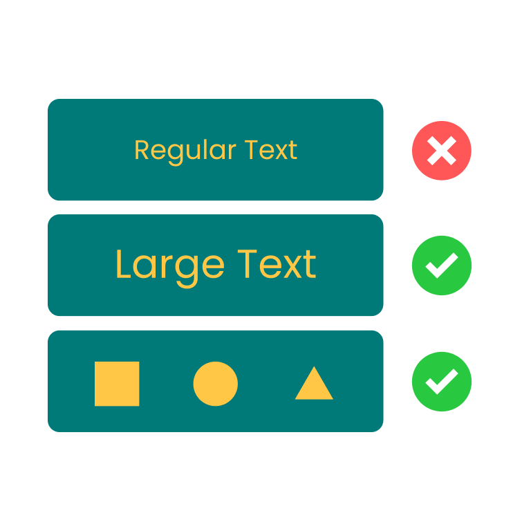
This is the workflow I keep coming back to. Drop in a brand color and a background, watch the ratio update live, then drag the lightness slider on whichever side is locked the least. The Z.Tools color contrast checker shows AA normal, AA large, AAA, and the 3:1 graphical-object check at the same time, so you can see exactly which target you are clearing and which you are still under. The default sample (yellow #FFC745 on teal #007A78) lands at 3.33:1 — fails AA normal, fails AA large, useful only as a non-text accent. Nudge the yellow lighter or the teal darker and the ratio climbs.
Where teams quietly skip the check
Three patterns I see again and again in front-end review.
Placeholder text. The default placeholder gray in most design systems sits between #9CA3AF and #A1A1AA, which is 2.5 to 2.7 against white. Placeholder is not exempt from the contrast rule unless it is purely decorative, and it almost never is. If users rely on the placeholder to remember what the field expects, it is text, and it needs 4.5:1.
Hover and disabled states. AA does not exempt disabled controls (1.4.3 has a "non-essential" carve-out for inactive UI controls, but most teams misread it). A disabled button label that fades to #D1D5DB on white is 1.6:1 and effectively invisible. The legal interpretation in the EU's EN 301 549 is conservative: if the disabled state still conveys information, contrast applies.
Charts and data viz. Chart legends and axis labels are normal text. Pie slices, line strokes, and area fills are graphical objects. Each pair of adjacent colors needs 3:1 to pass 1.4.11. Most default chart.js and recharts palettes do not meet that bar against white.
Sketching the rest of the toolchain
Once a contrast ratio is the gating constraint on a brand color, the next move is usually to rebuild the palette around it instead of tweaking ad hoc. A Tailwind palette generator gives you a full 50-to-950 ramp from one seed color, so you can pick the rung that hits 4.5:1 against your background instead of darkening by guesswork. A color wheel helps when the ratio is fine but the hue clashes; a gradient editor helps when the failing pair is a button background and you want a blend instead of a flat fill.

The thing to take away is that 4.5:1 is a measurement, not an opinion, and the formula has been public and unchanged since 2008. If a stakeholder pushes back on a contrast finding, the answer is to compute the luminance ratio in front of them. The formula does not take feedback. It just gives a number, and that number is either at least 4.5 or it is not.
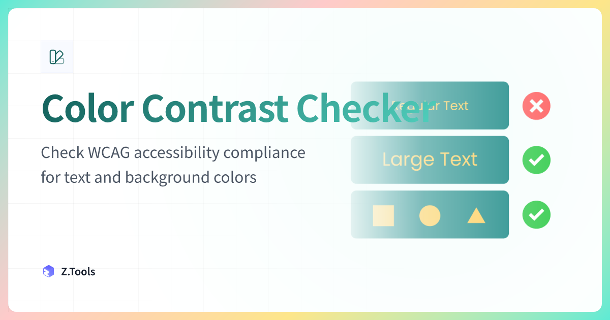
Color Contrast Checker · Z.Tools
Check WCAG accessibility compliance for text and background colors
- accessibility
- wcag
- color
- design
继续阅读
TTS in an accessibility plan: where it helps, where it stops
Adding text-to-speech to a website or app looks like an accessibility win. Sometimes it is. Sometimes it is a checkbox that distracts from the real accessibility work. Here is the honest map of where TTS helps and where it does not.
Live captions are not the same as accessible captions
Auto-generated captions look like an accessibility solution and usually aren't. Here is the difference between live captions and accessible captions, why ADA and WCAG care, and what good practice looks like in 2026.
MiniMax HD vs Turbo vs Eleven Flash for finished work
MiniMax 2.8 HD, MiniMax 2.8 Turbo, and Eleven Flash v2.5 cluster at adjacent per-character prices but split sharply on use case: broadcast finals, fast Chinese agents, and 32-language streaming respectively. Here is which one to pick when.